PLAIN-ENGLISH WEBSITE DIAGNOSTIC
Your website is getting visits. Why is nobody enquiring?
A practical diagnostic for separating a traffic problem from a page, proof, form or mobile-use problem before rebuilding the whole site.
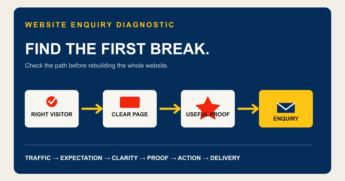
DIAGNOSE BEFORE YOU REDESIGN
First, make sure this is a website problem.
“The website is not working” can describe at least four different problems:
- hardly anyone visits it;
- the wrong people visit it;
- suitable visitors do not enquire; or
- enquiries arrive but they are poor quality.
If the site gets almost no relevant traffic, changing a button colour is not the answer. If it attracts people looking for jobs, DIY instructions or a service you do not offer, it may be visible for the wrong intent. If suitable prospects reach the correct service page and disappear, the page deserves a harder look.
Check analytics, Search Console, form delivery and call records before drawing a conclusion. If those are not set up, fix the measurement first.
CHECK 1
Did the search result promise one thing and the page deliver another?
The enquiry problem may begin before the visitor arrives.
Imagine an electrician whose result says “24-hour emergency electrician”, while the page never confirms after-hours availability, service area or how quickly someone answers. Or a construction company visible for “home renovations” whose homepage speaks almost entirely about commercial work.
Compare the search query, result title and first screen of the landing page. They should tell the same story. Google recommends concise titles that accurately describe a page; this also sets a visitor's expectation.
Check: Could a visitor repeat what you do, where you do it and what to do next after five seconds?
CHECK 2
Does the homepage make the visitor translate the business?
“Quality solutions tailored to your needs” sounds safe because it says almost nothing. The visitor still has to work out:
- what you actually do;
- whether you work with people like them;
- whether you cover their area;
- whether the job fits your scope; and
- whether they should call, book or request a quote.
A useful opening names the service, customer or job type, location where relevant, and the next action. Use only details the business can genuinely support.
Check: Circle every phrase on the first screen that could appear unchanged on a competitor's website. Rewrite or remove it.
CHECK 3
Is the proof useful to the buyer?
A logo wall, licence number and years-of-experience line can support trust. Useful proof depends on the job:
- a landscaper may need finished-project photography and clear project types;
- an accountant may need verified qualifications, team profiles and a plain description of who the firm helps;
- a plumber may need service area, real reviews, licence details and an honest explanation of urgent availability;
- a builder may need project examples, capability, process and clarity about the work accepted.
Do not invent proof to fill a design. If the business is new, show the people, process, scope and real work available. Label uncommissioned concepts as concepts.
Check: Does each proof item remove a real reason to hesitate, or is it decoration?
CHECK 4
Can the visitor tell what happens after clicking?
“Contact us” is an action, but it leaves sensible questions unanswered. What should they send? Will someone call or email? Are they requesting a quote, checking availability or booking? What happens with urgent work?
Use the action the business can honour: Request a quote, Check availability, Send your project details, Book an appointment or Call about an urgent fault.
A first enquiry rarely needs 16 required fields. Ask for enough information to respond properly, then continue the conversation.
Check: Submit the form yourself on a phone. Confirm it arrives, the confirmation makes sense and the reply path is clear.
CHECK 5
Can a customer use the page on the device in their hand?
Mobile-friendly does not mean the desktop layout shrank without visibly breaking. Test the real tasks:
- Can someone read the opening without pinching or zooming?
- Is the phone number tappable?
- Does a fixed banner cover the next action?
- Are form fields comfortable to complete?
- Can they find services, area and proof without fighting a menu?
Google uses the mobile version of site content for indexing and ranking. More importantly, customers should not have to debug a layout while comparing providers.
Check: Use the site on a small phone, on mobile data, with one hand.
CHECK 6
Does every visitor get pushed to the same step?
Not every suitable prospect is ready for a quote. One may want to see projects. Another needs to check fit. Someone with an urgent problem wants a phone number.
This does not mean adding five competing hero buttons. Build a sensible path:
- state the main service and audience;
- show the relevant services or project types;
- answer the largest trust questions;
- explain the process; and
- make the next action obvious when the visitor is ready.
CHECK 7
Does the offer create avoidable doubt?
A visitor may like the work and still hesitate because the commercial details are foggy. Common unanswered questions include whether this is a quote or booking, which areas are covered, what is included, and what happens after the enquiry.
You do not need to publish a fixed price when the work genuinely needs scoping. You do need to explain how a quote is determined and what the visitor should expect next.
For website-service quotes themselves, use the Australian website cost comparator to make recurring fees and ownership terms visible.
FIX THE LARGEST BREAK FIRST
Do not turn this into a 60-item redesign project.
Choose the first material break in the path:
- wrong traffic;
- unclear opening;
- missing service or area information;
- weak proof;
- confusing next step;
- broken form; or
- poor mobile experience.
Fix that, measure again, then move to the next break. Changing ten things at once may make the page prettier, but it teaches you little about what mattered.
RUN THE PLAIN-ENGLISH CHECK
Start with the page you already have.
The free SMB Sites website check reviews technical and content signals, then emails the result. The same page also includes a public 12-point homepage checklist that needs no email.
Neither can explain why every visitor behaved as they did, replace analytics or predict enquiries. They can give you a practical place to start.
If the site needs a bigger change, see how SMB Sites prepares a first homepage direction before you commit.